Category:
Quick redesign
Role:
Product Designer
Team:
Product designer, PO, CTO, 1xFE
Timeline:
4 weeks
In August 2024, I received a project to deliver a new feature to support Multi-Document uploads within 4 weeks. It was a rather simple concept. During the early design phase for adding this feature, I recognised that the document feature would clash with the outdated 'Attachment' functionality that the backend could not deprecate within the timeline.
This case study demonstrates how I convinced the stakeholders with strategic design decisions to implement an interim solution to handle the outdated 'Attachment' without burdening the backend and complicating the frontend.
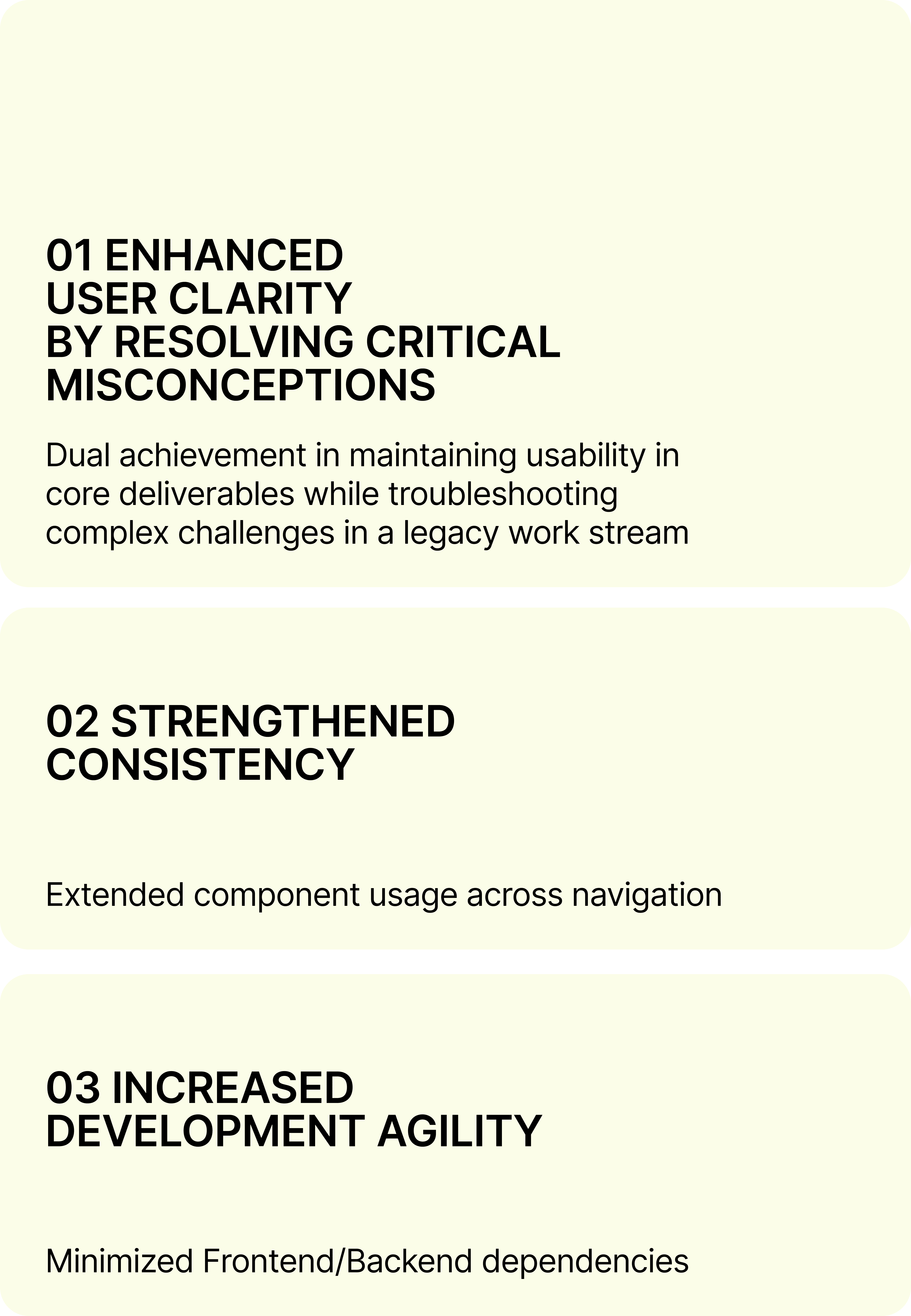
IMPACT ————
COMPANY CONTEXT ————
My team is highly developer-centric, prioritizing basic functionality where user testing is often deprioritized, and technical feasibility drives most decisions. Before my arrival, random elements were applied across use cases. While the platform is evolving and a full redesign is not feasible, I focus on the current and upcoming roadmap projects to enhance the platform strategically.
In this project, I stick to my Rule #1, i.e. to bring up a reusable component that I designed for the document-item element to handle the 'attachment'.
CHALLENGES ————
Reinventing the wheel was not an option.
Generating another project within a tight development parameter was not an option.
Limited data is available (only the #attachments).
User testing is deprioritized.
Design proposals must be beyond compelling and feasible to get the engineers' 100% devotion.
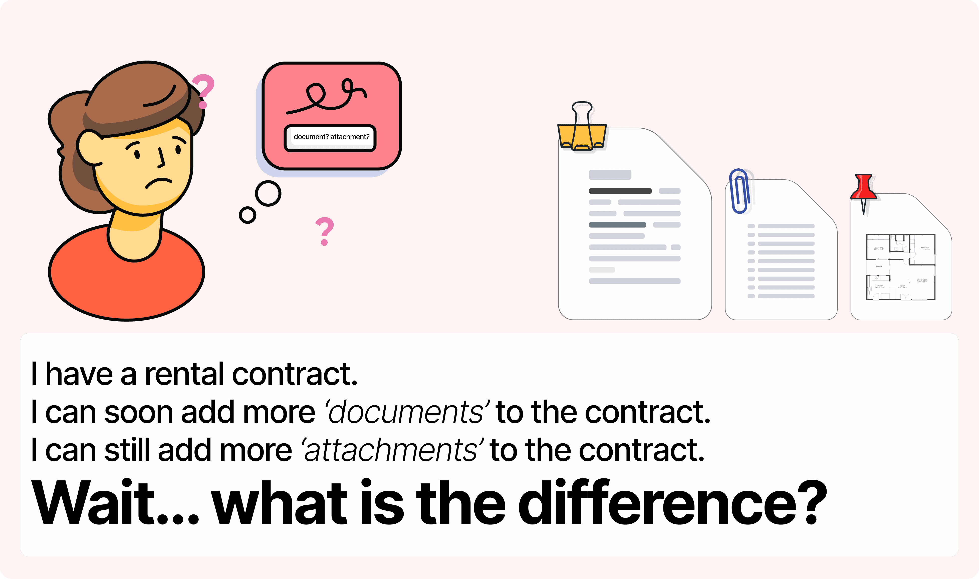
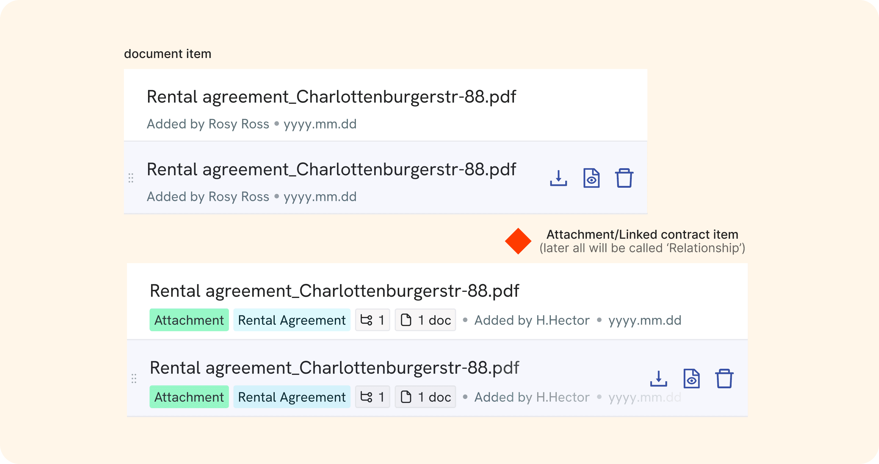
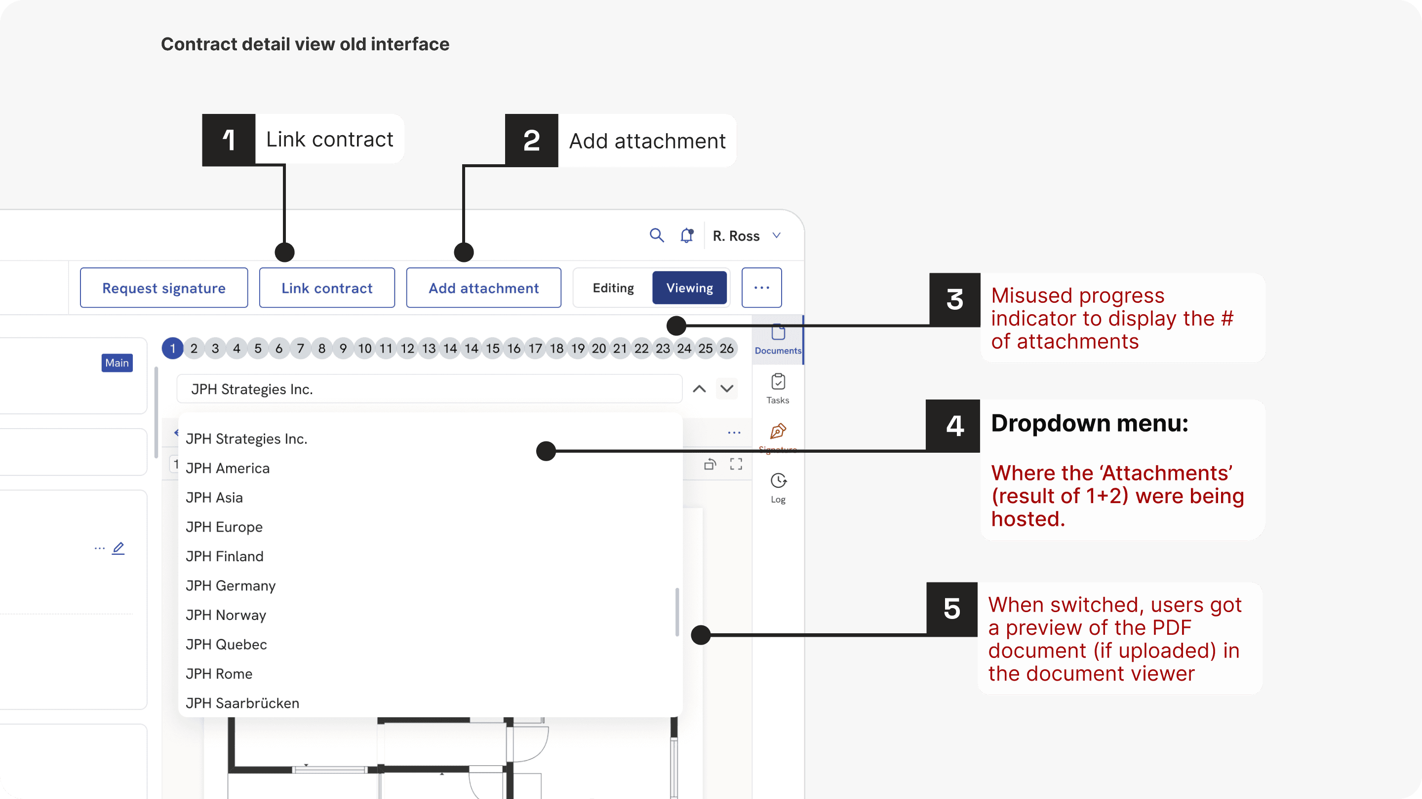
First of all, what are 'Attachments'?
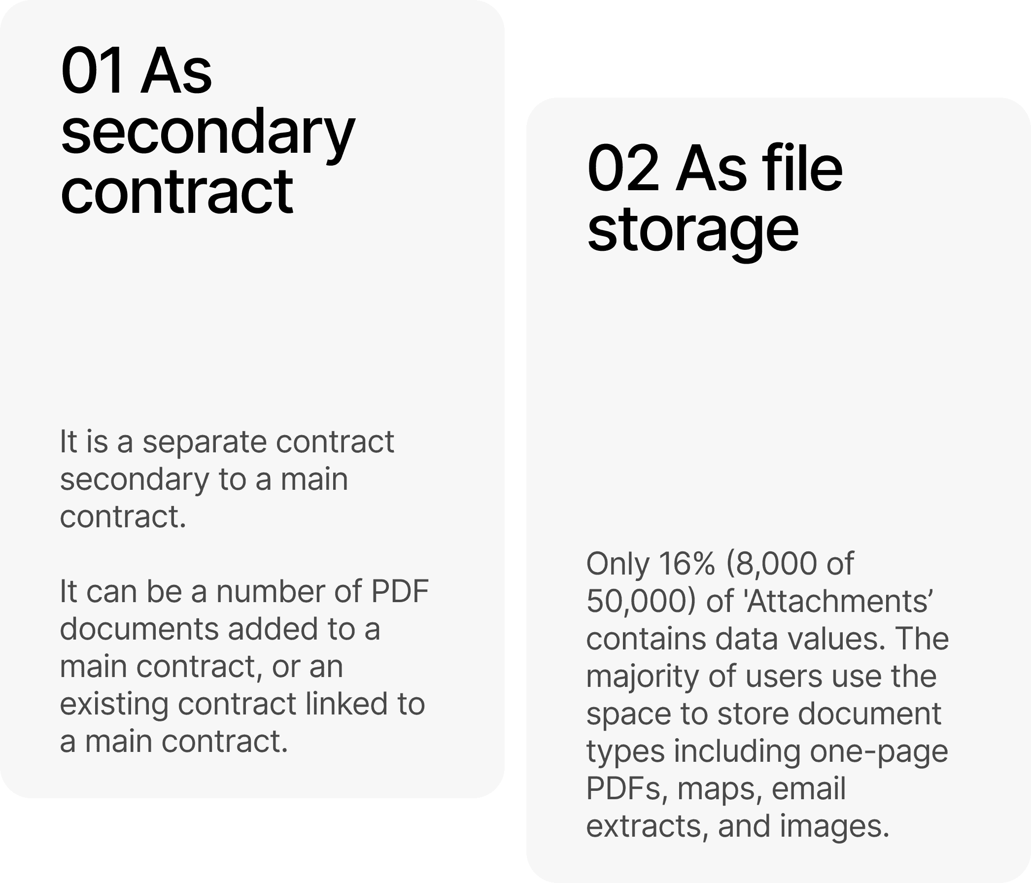
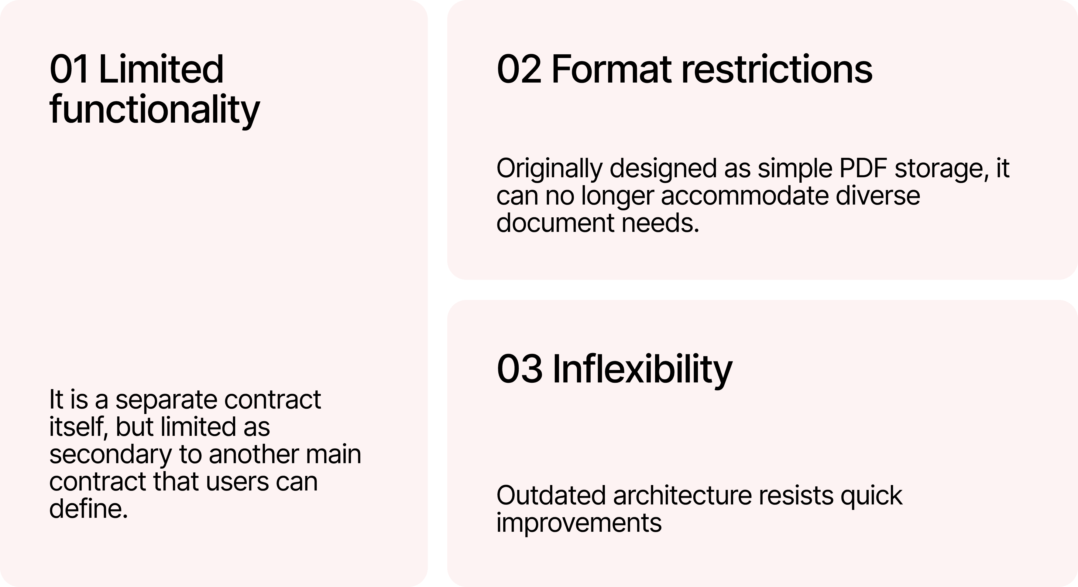
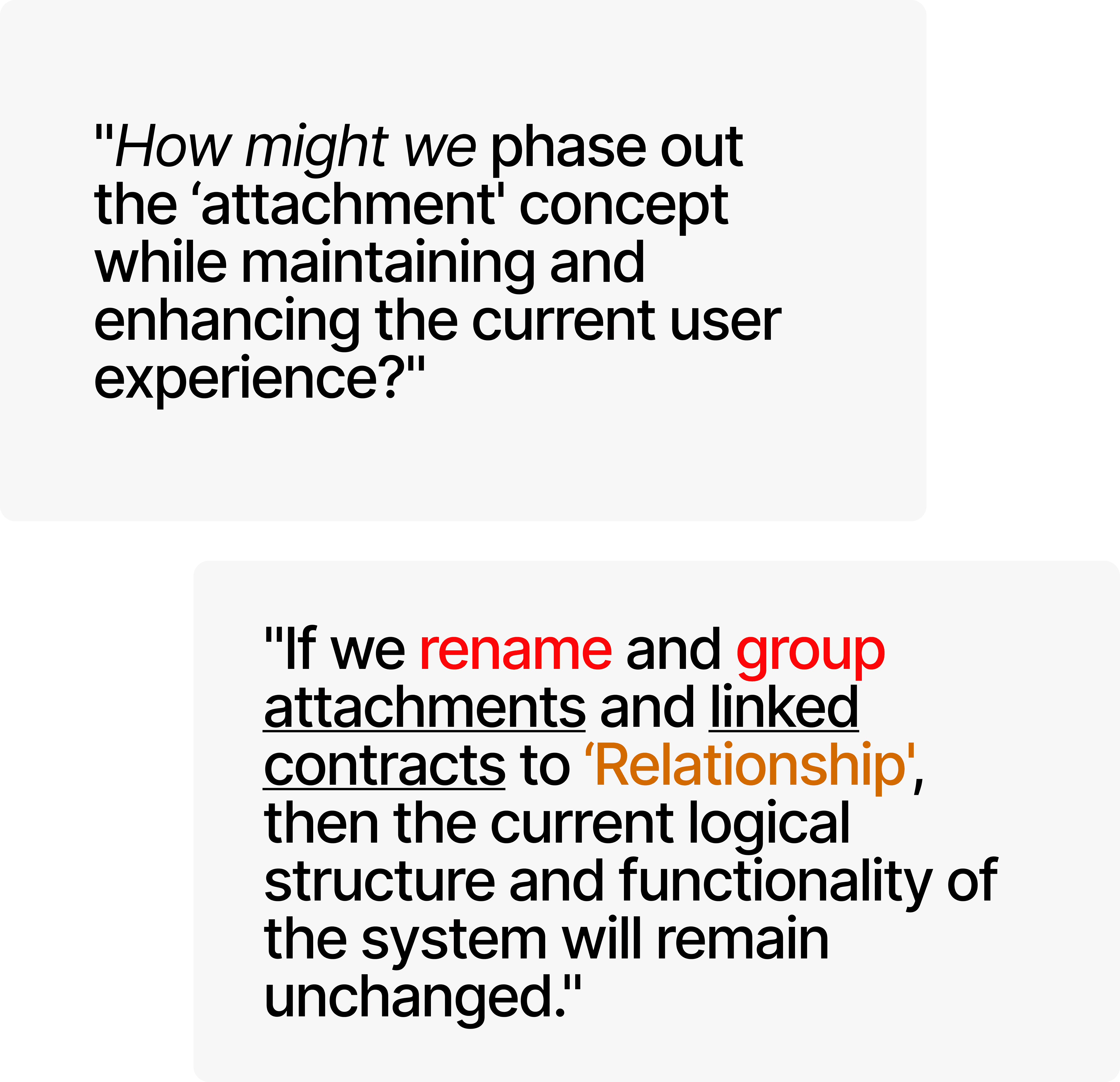
What makes the 'Attachments' architecture fundamentally challenging to scale?
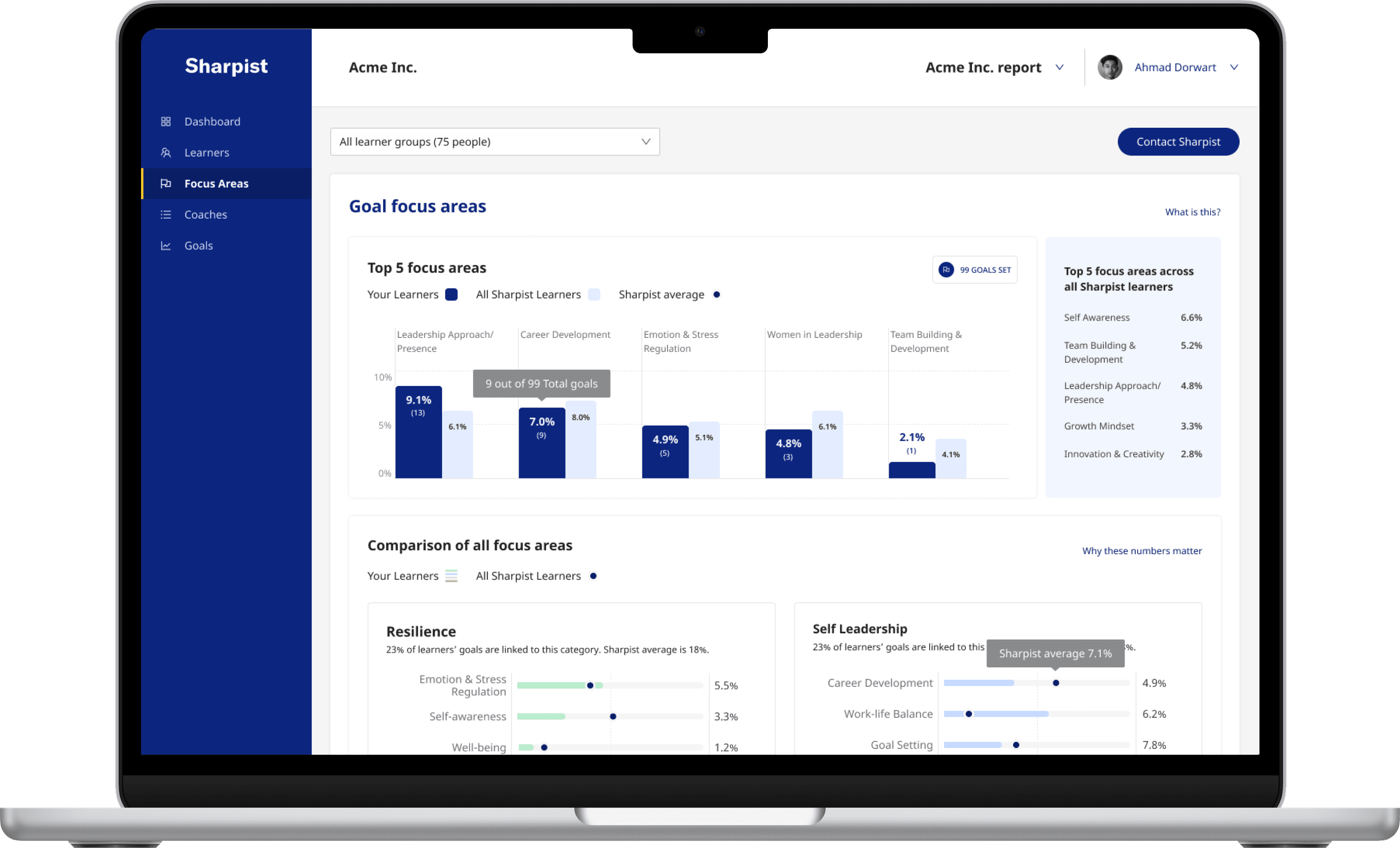
The Multi-Document Support structure introduces additional complexity, as overlapping actions like "Add Attachments" and "Link contract" create user confusion between document handling and attachment management, compromising interface clarity.
See the old interface for 'Attachments' below:
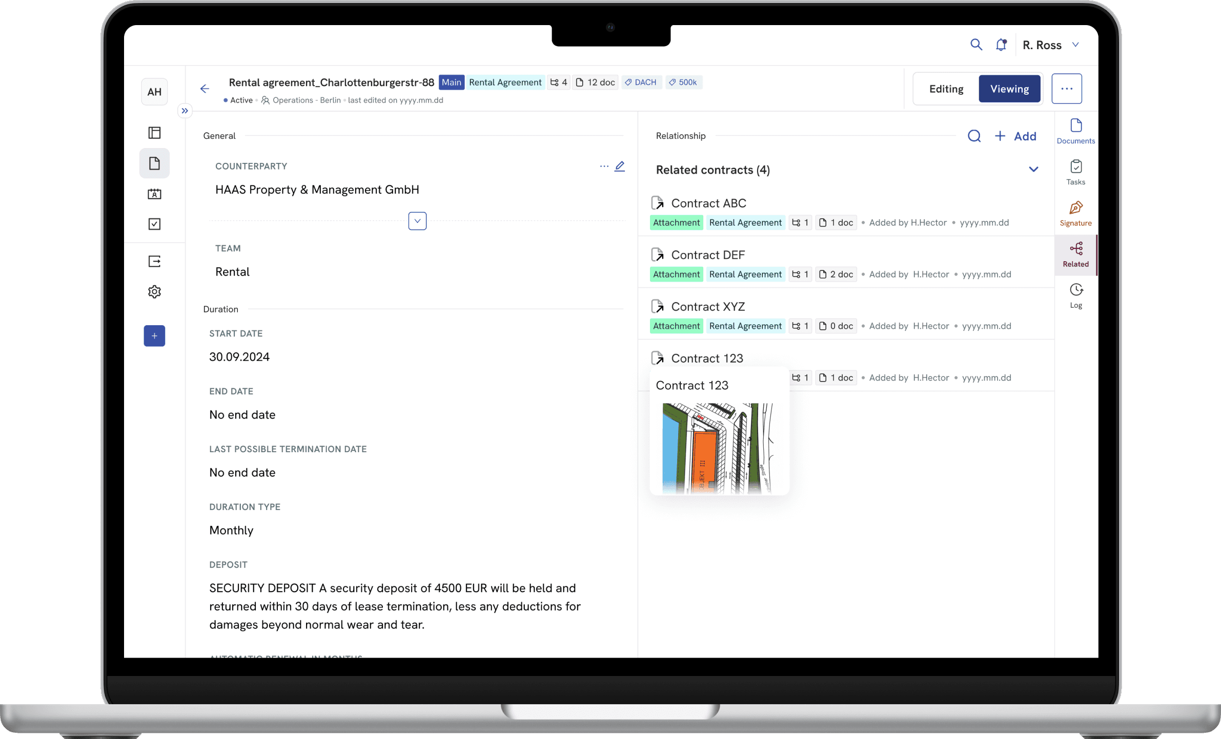
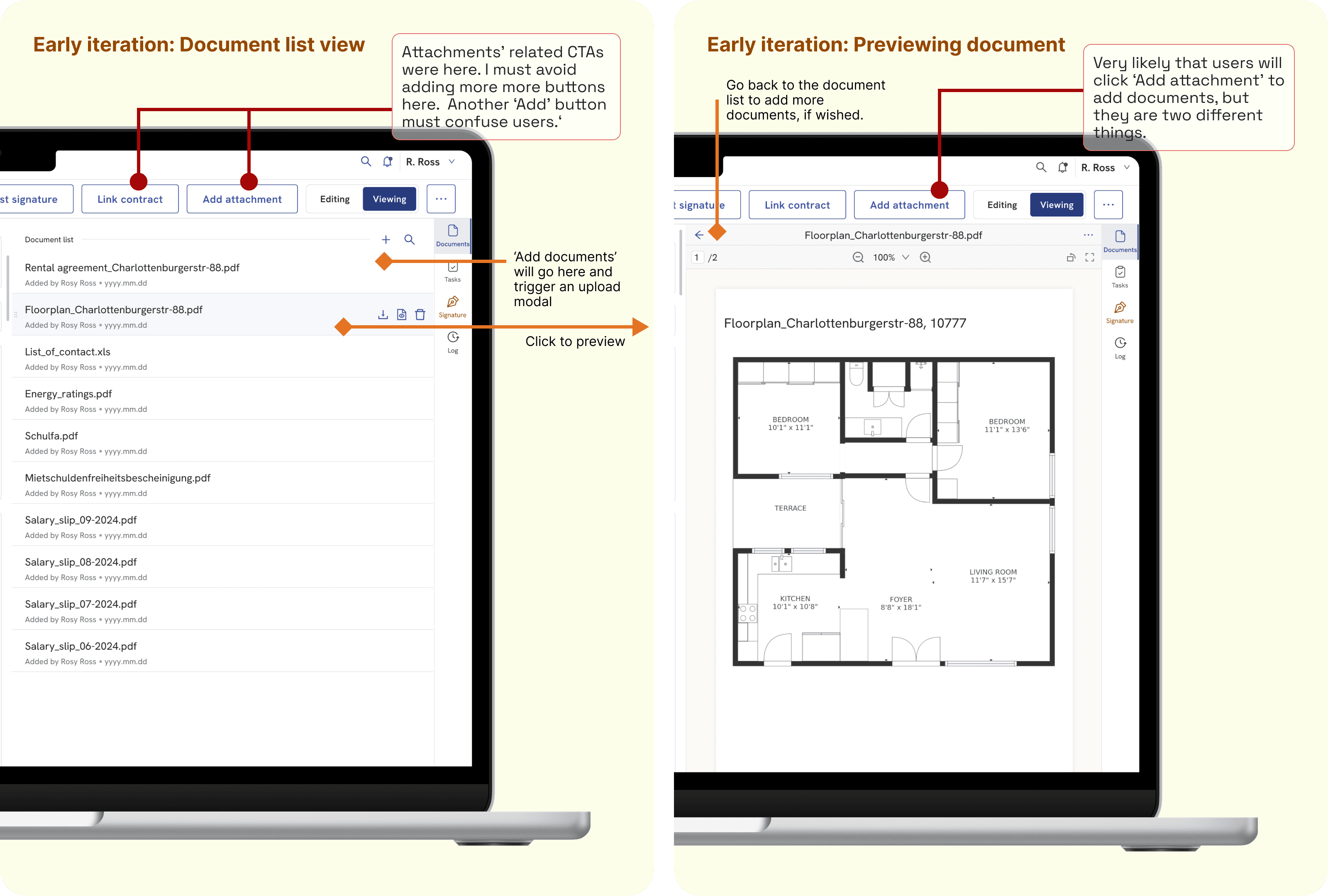
You will find the early iteration for Multiple Document Support in the Document tab below.
While the iteration confirmed that properly handling the list of attachments remains important, it also revealed that attachment-related actions should be removed to avoid confusing users.
L: Document list
R: Document viewer
SOLUTION SPACE ————
Users can now digitally file and manage contracts in a document repository supporting various file formats. The Document tab enables document navigation as shown above, while the new 'Related' tab organizes current 'Attachments' and 'Linked contracts' (later 'Related Contracts').

ITERATIONS ————
This solution rolled out quickly without pre-launch testing, reflecting our team's operational reality. As the only designer in a culture that prioritizes intuition-based implementation, I identified the problem, proposed an interim fix, and saw development begin the next minute. Though I advocate for testing to prevent guesswork and rework, I supported our rapid development approach while closely monitoring post-launch user feedback.
My initial design aimed to preserve all attachment functions before a phase-out could be planned. First, I removed the secondary buttons from the header area and placed them with icon-only buttons for "add attachment" and "link contract" in the new Related tab, like in the Document tab.
Post-launch qualitative feedback revealed that it had led to users clicking the wrong "+" button, as shown in the left image.
I quickly iterated the design by removing one "+" icon-only button. Now, one + Add button triggers a menu with options to "add attachment" or "link contract," as illustrated in the right image.

FURTHER ITERATIONS ————
Despite limited research, my design increased the clarity of 'Attachments' (in a tab) as related contracts, especially to newly onboarded users. However, longtime users missed the visibility provided by the previous dropdown menu for 'Attachments', despite its scaling limitations.


REFLECTION ————-
It is a perfect example to learn from imperfect situations.
Having an assumption/hypothesis is essential in the earlier phases, e.g. define, ideation. However, skipping the validation of the assumption and hoping the users will feel the same is risky. Retrospectively thinking in such a fast environment, I would have seized a couple of hours to test the tab ideation with at least the internal users. This time, the team prioritised speed over learning.
Without the step to quickly validate, we did not achieve lean UX. At its best, it may be an ‘effective guessing’. To fix it, I quickly took immediate actions based on feedback, and have those insights acted upon in iterations. In future, the team must share the goal to reduce confusion, not just 'ship features', and schedule time to analyze feedback and adjust immediately.