Category:
Redesign & Scalability
Role:
Product Designer
Team:
Product designer, PO, CTO, 1xFE
Timeline:
4 weeks

Fast-paced growth sometimes breaks scalability. While scoping a new multi-file upload feature, I discovered the attachment flow could not support it, and would even stall delivery.
Instead of patching it, I redesigned the flow into a scalable, unified system that met both legacy and new needs, clearing years of design debt and ensuring an on-time launch.
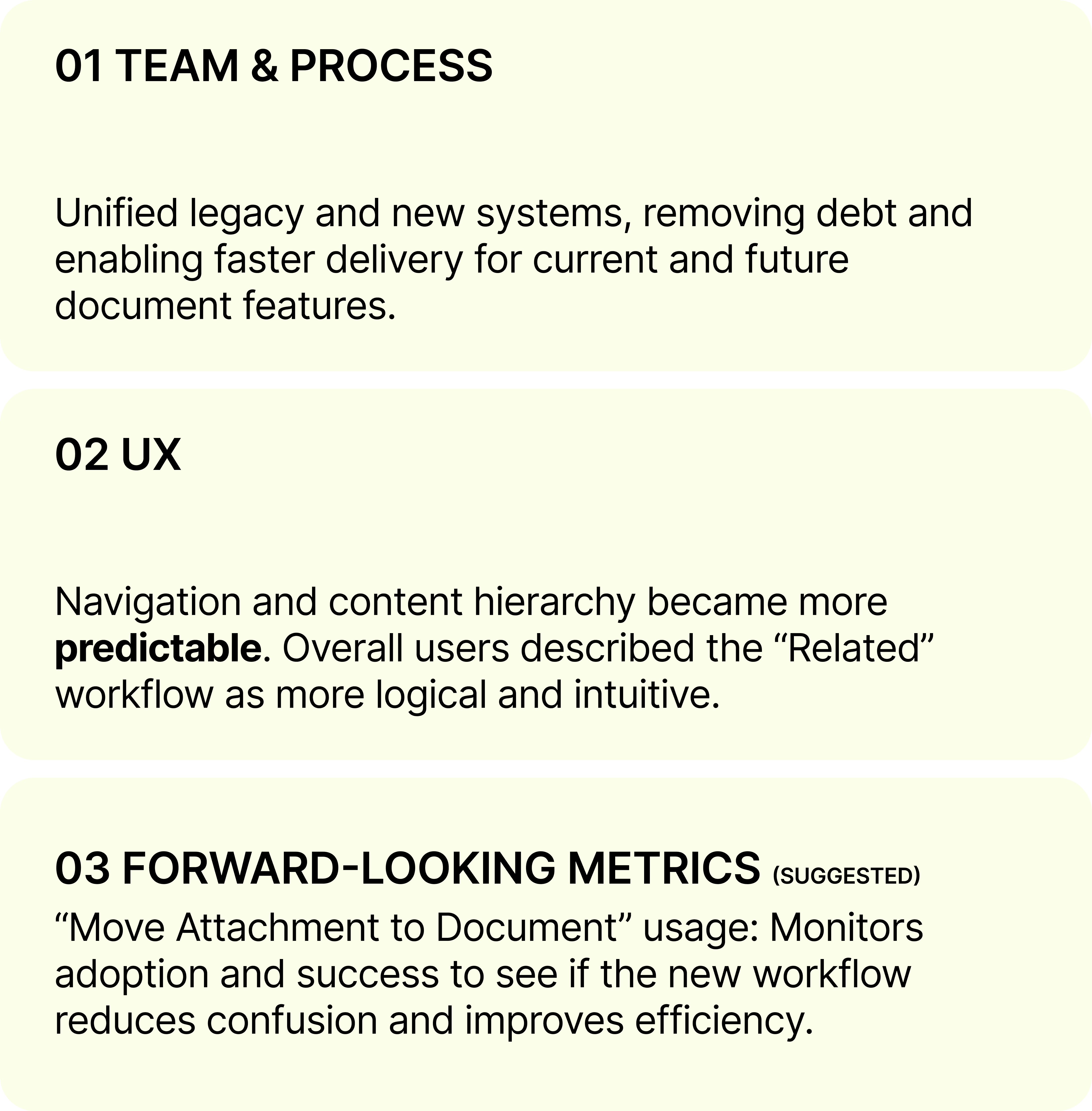
IMPACT ————

CHALLENGES ————
Low developer bandwidth. Limited data. No testing runway.
All increased risk. Inconsistent, reinvented UI elements eroded trust and built up design debt.
What is "Attachment" when it was first introduced?


In discovery, I flagged a key mismatch between the new multi-upload feature and the legacy attachment flow. The current button hierarchy would create user confusion.


SOLUTION SPACE ————
What I designed: Key Interventions
Clearer Naming: Renamed “Attachment” to “Related Contract” and moved it into its own tab to remove ambiguity.
Scalable Component: Created a new document component with reusable instances for all file types, eliminating reinvention.
Improved Workflow: Added a quick-preview feature for instant document viewing and fewer clicks.

ITERATIONS ————
The rush to market meant no user testing. While not disastrous, the lack of validation led to immediate nervous feedback and quick rework. Below was one of the rework right after the release:

FURTHER ITERATIONS ————
The new "Related Contracts" tab successfully increased clarity for new users. Yet, the change created a new tradeoff: longtime users missed the quick "hack" they used to peek at content via the previous dropdown menu.


REFLECTION ————-
This project highlighted the risks of building on an unscalable foundation. Speed initially took priority, but outdated functions soon slowed development.
Shifting focus from patching to solving the root problem, I introduced a reusable component that reduced complexity, accelerated development, and prevented design debt, demonstrating that scalability is as much a design decision as a technical one.